Bar charts are everywhere, and it’s hard to make them not boring. One way to dress them up a bit is to replace bars with dot-line combinations. This is pretty simple to pull off using ggplot2: I’ll show how below.
The data comes from the Winning the Internet project from The Pudding, hosted on GitHub here. Winning the Internet aggregates the links shared across a number of different newsletters… so it’s a newsletter of newsletters, sort of.
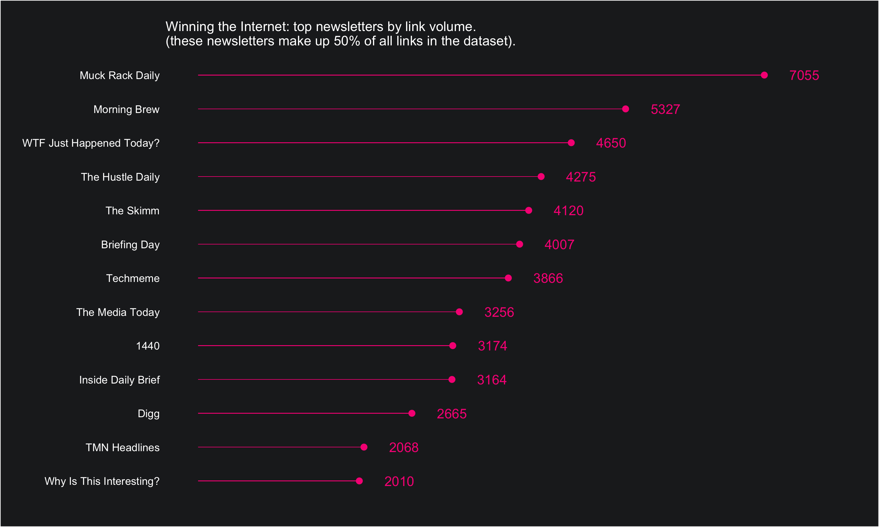
The dataset is simple: one row per URL and columns corresponding to the URL itself, the date of publication, the newsletter it was published in, and whether or not The Pudding classifies the link as spam (eg, not a real link to content).
Once we have it as a df, we can do a little bit of summarizing using count() and mutate() and then pipe the data into a visual:
df %>%
	count(newsletter, sort = T) %>%
	mutate(share = n / sum(n),
     		cumulative_share = cumsum(share)) %>%
	filter(cumulative_share <= 0.5) %>%
	ggplot(aes(reorder(newsletter, n), n, label = n)) +
	geom_text(nudge_y = 500, color = "#F72485") +
	geom_point(color = "#F72485", size = 2) +
	geom_bar(stat = "identity", width = .02, fill = "#F72485") +
	ylim(0, 8000) +
	coord_flip() +
	labs(x = "", y = "",
    subtitle = "\nWinning the Internet: top newsletters by link volume.
    				   \n(these newsletters make up 50% of all links in the dataset).") +
	 theme_custom()
A standard bar chart would use geom_bar() to do the heavy lifting when encoding the data. What we’ve done here is made the bars really skinny, and then also encoded the data in end of bar points using geom_point() and labels geom_text().
If you’re interested in the full code (including the themeing that goes into the theme_custom() function at the end of the chunk above, you can find it all here: rentry.co/puddinglinks1