NBA Conference Finals: most searched team by state
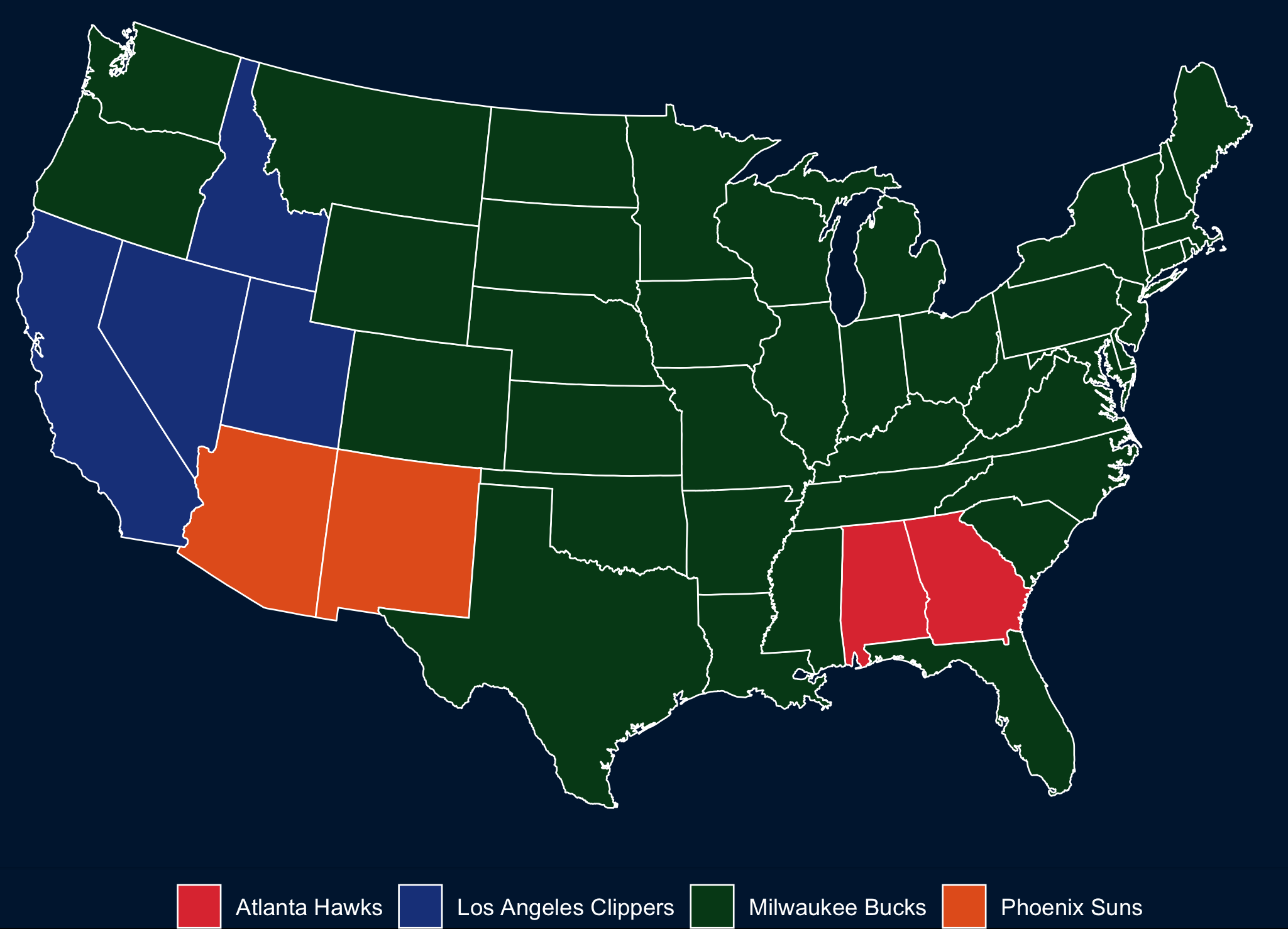
NBA Conference Finals: most searched team by state
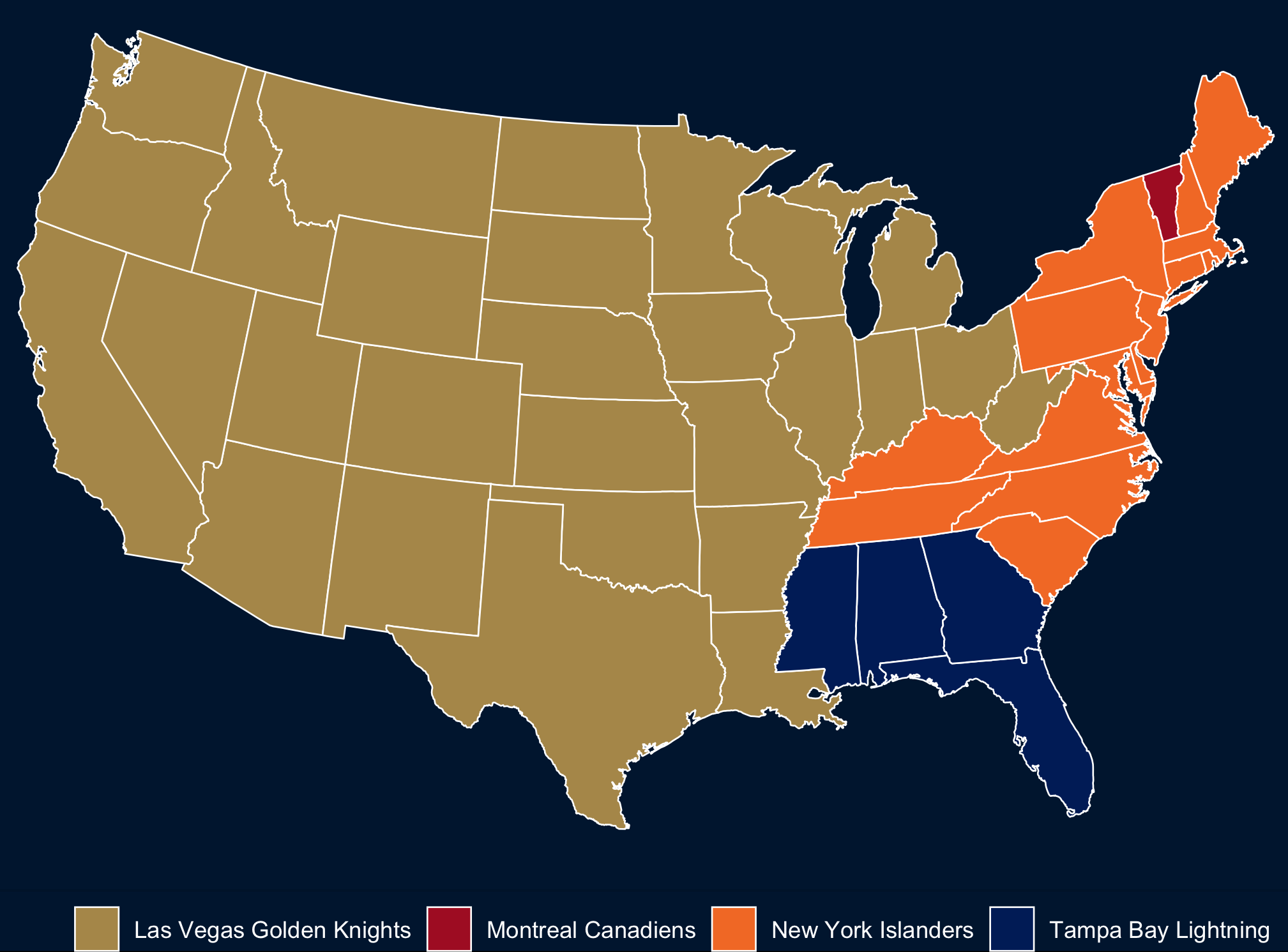
I found this story indicating that the New York Islanders are the most popular team across the US a little hard to believe, so I took a look at Google Trends. That seems a little more plausible. Then I made my own map, because I like maps. Code here: rentry.co/nhlmap.
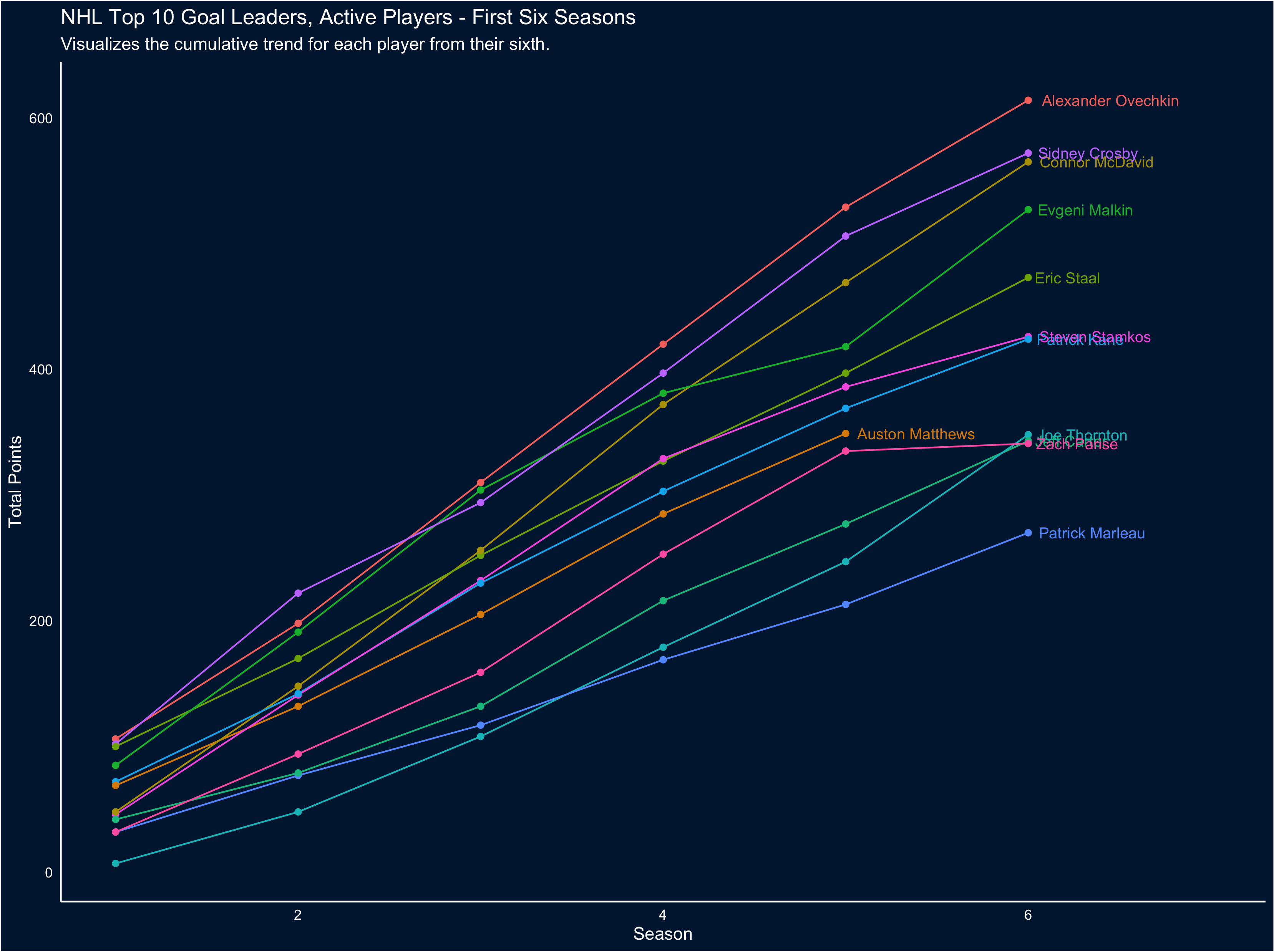
I was fooling around recently with some NHL stats visuals, and decided to update them tonight while watching the Caps-Bruins game (wouldn’t it be great if both teams lost?). Connor McDavid and Auston Matthews have had amazing seasons, and I was interested in putting their career success to date in the context of some of their peers. This was pretty easy, thanks to the folks at Quant Hockey.
The peerset for all of these visuals is Top 10 Active Goal scorers, plus McDavid and Matthews. To start, let’s take a look at cumulative career goals progressing along the x axis from the first season played to the most recent one (players with longer careers will have longer trend lines):
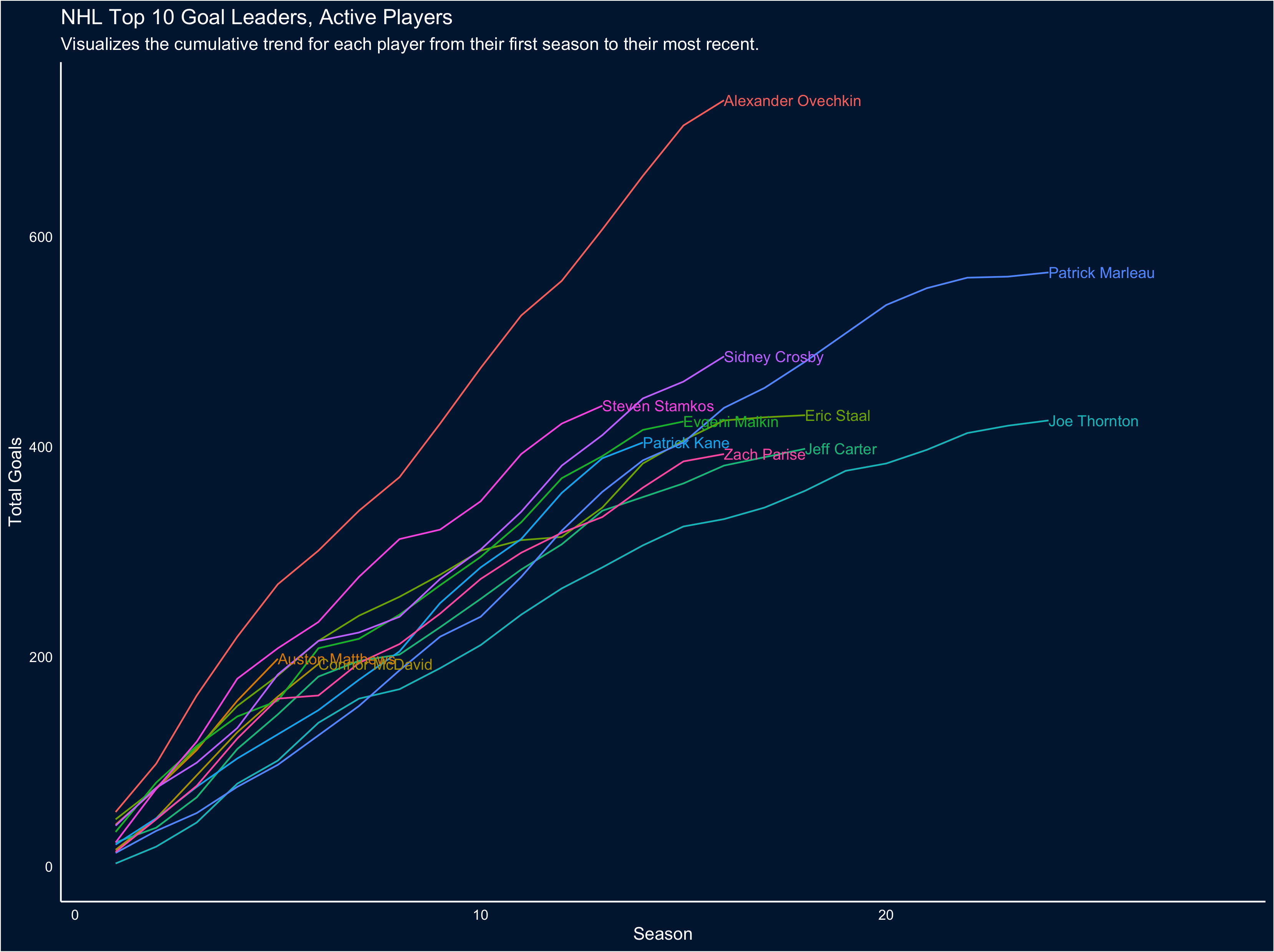
The first obvious takeaway from this chart is just how much of a goal-scoring beast Ovechkin is; also interesting to note the exceptional careers of Marleau and Thornton. But because of the number of trend lines it’s a little hard to pull out how McDavid and Matthews' careers-to-date scoring compares, so let’s restrict the visual to the first 6 seasons for each player (to match McDavid’s career so far):
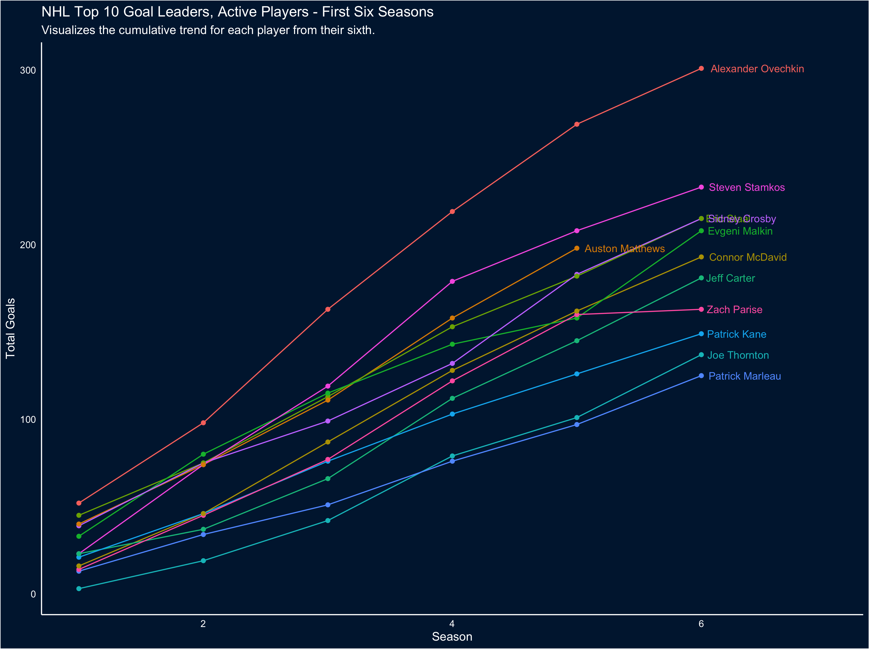
It’s easier to tell, here, exactly how special Matthews' goal scoring is: he’s outpacing everyone other than Stamkos and Ove (Incidentally, this also clearly demonstrates what a phenom Stamkos was and is).
Goal scoring is only part of the story - we can also look at total points. So let’s reproduce the first two visuals, but looking at cumulative points instead:
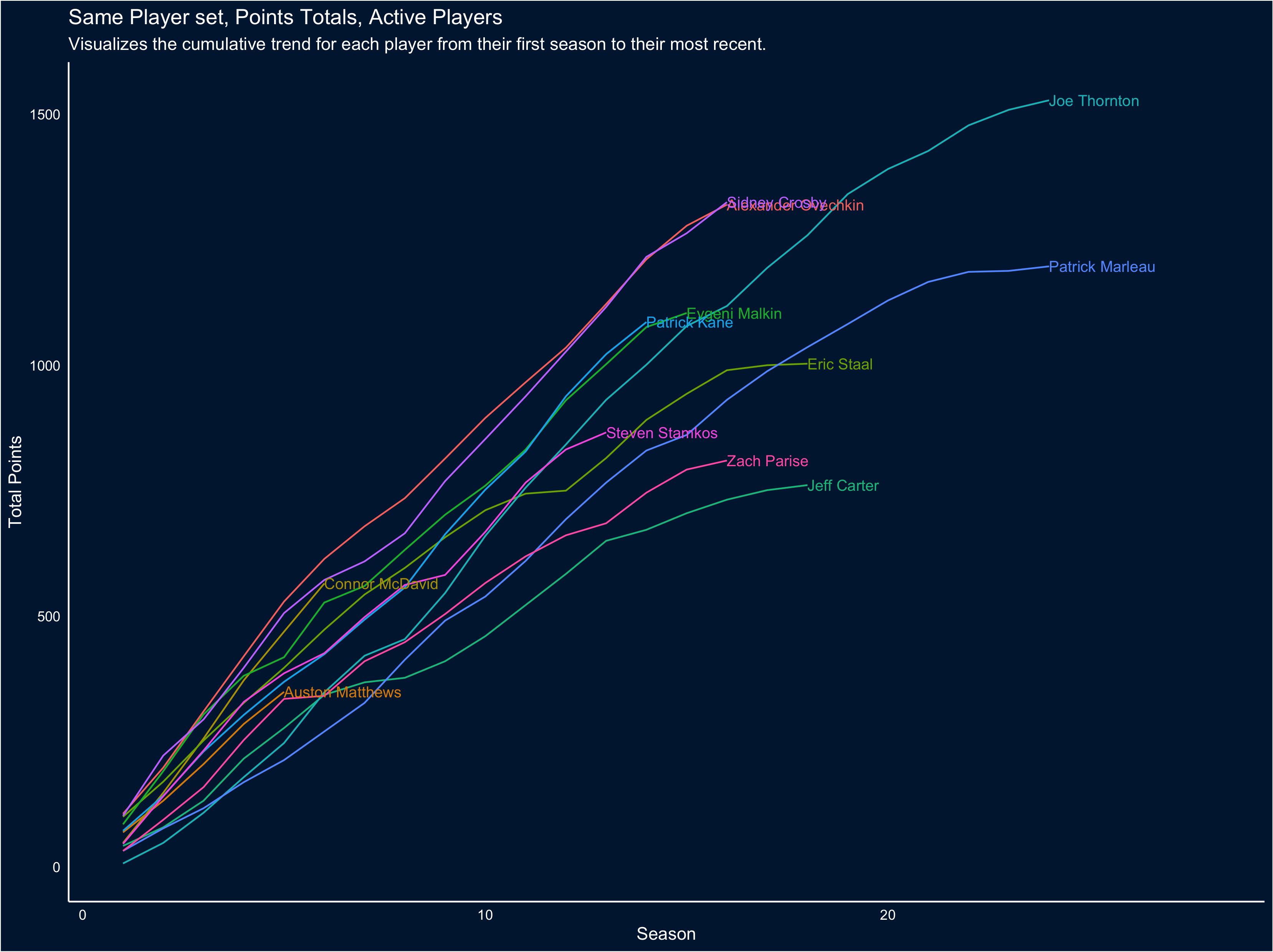
To me the amazing thing this visual captures is now neck-in-neck the careers of Crosby and Ovechkin have been… and also how much of an offensive powerhouse McDavid is, when assists are factored in. That only gets clearer when we focus on the first 6 seasons of each career:
If you’re interested, you can find the code for these visuals at this link: rentry.co/scoring
It is tricky to encode both absolute and percentage variables in the same visual.
Consider the main chart in this recent Upshot piece concerning Q1 2021 GDP figures. The story is about which sectors are doing better than expected and which are doing worse. They get at this in a fairy nifty way, by comparing actual results for Q1 to hypothetical Q1 results had all sectors grown at a 2% annual rate since Q4 2019. Given this, the main chart focuses on the percentage difference between the real Q1 and the hypothetical Q1. This is a wholly defensible choice.
What the chart doesn’t tell you is any information about the absolute size of each sector. In some cases that information is highly relevant. So in this visual, I thought about ways that you could potentially encode both without changing the basics all that much.
The Upshot story uses the Advance Estimate GDP data released by the Bureau of Economic Analysis. The BEA has an API and an R package that goes along with it but based on a cursory look I don’t think they’ve made the most recent data for Q1 2021 available through the API yet, so I downloaded the excel file (direct download link). I fudged the analysis a little bit: the key comparison in the Upshot relies on growth from Q4 2019, which isn’t in the file above, so I just used Q1 2020 (which is). As a result the numbers in the visual below aren’t 1:1 with the Upshot chart, but they are directionally consistent.
What I landed on was a visual I don’t think I’ve ever built before: a bar chart where the length of the bar encodes the percentage change (like the original) and the width of the bar encodes the absolute size of the sector (specifically, Q1 2021 billions of dollars, seasonally adjusted at annual rates).
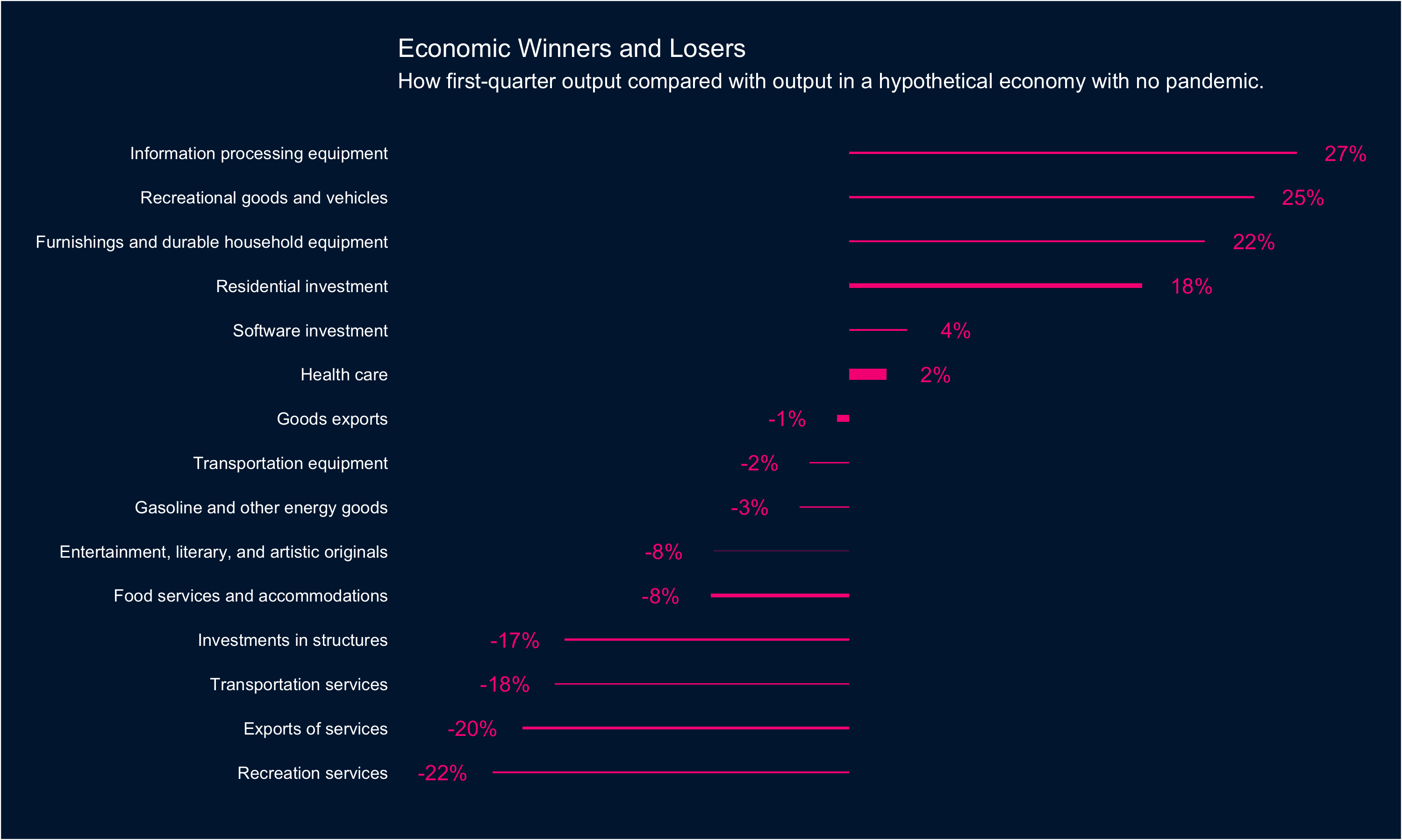
In this case there isn’t a ton of variance in the data: Health care is noticeably bigger than other sectors (and Entertainment noticeably smaller) but otherwise there aren’t huge swings from sector to sector.
If you’re interested in the code you can find it all here: rentry.co/beagdp
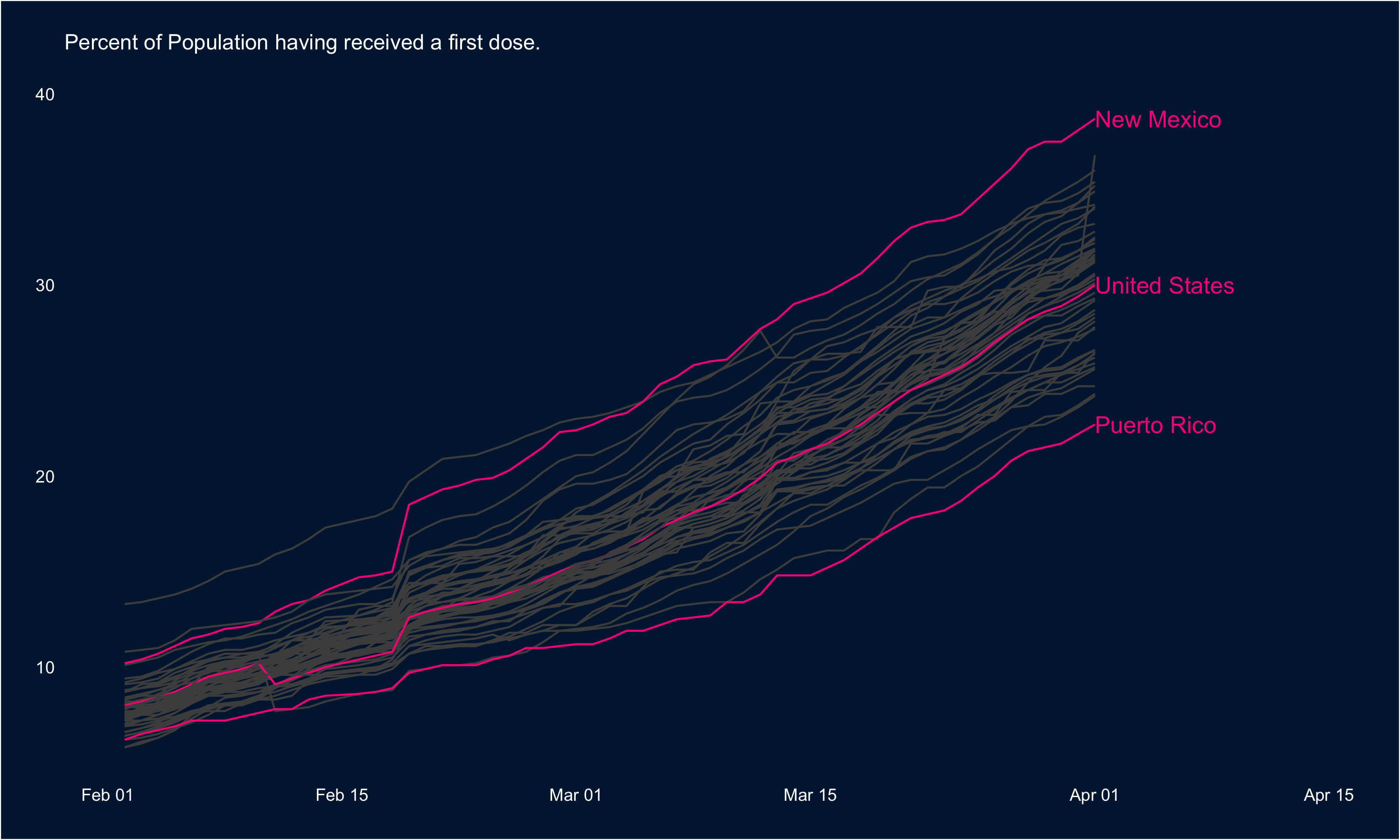
Via this week’s Data is Plural email, the CDC’s daily vaccination statistics are being hosted on GiHub here. These are pretty amazing data, so I thought I’d take a quick look using some of my favourite R packages: ggplot2 and highcharter.
First, we can look at rate at which first doses are being administered across the States. In the visual below, I’ve highlighted the national trend as well as the tops and tails: New Mexico leads the way in terms of the percentage of the population having received a first dose, and Puerto Rico has the lowest rate.
These data are highly conducive to mapping as well, so I’ve put the most recent data (Apr 1) in a map below:
If you’re interested in the code you can find it all here: rentry.co/cdcvacc
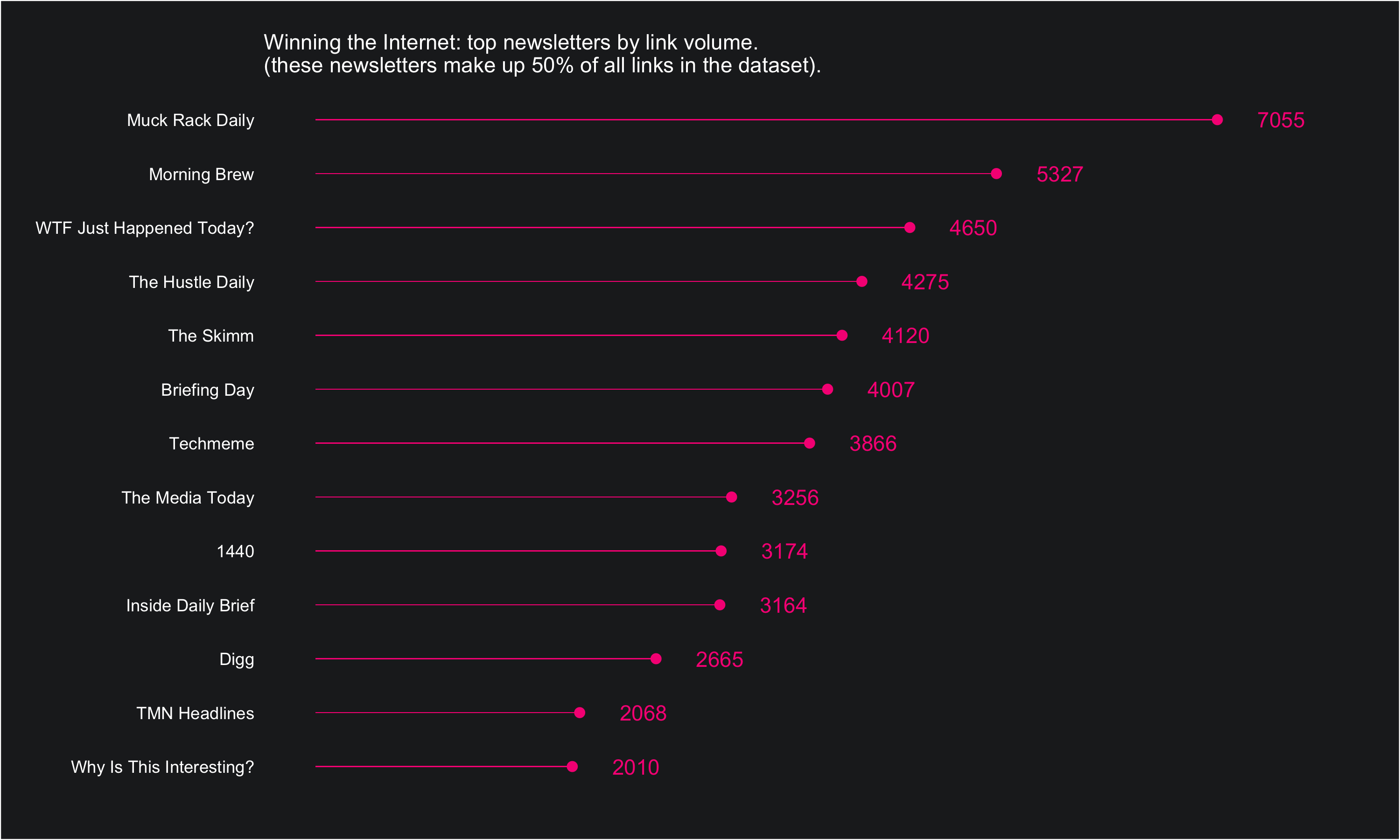
Bar charts are everywhere, and it’s hard to make them not boring. One way to dress them up a bit is to replace bars with dot-line combinations. This is pretty simple to pull off using ggplot2: I’ll show how below.
The data comes from the Winning the Internet project from The Pudding, hosted on GitHub here. Winning the Internet aggregates the links shared across a number of different newsletters… so it’s a newsletter of newsletters, sort of.
The dataset is simple: one row per URL and columns corresponding to the URL itself, the date of publication, the newsletter it was published in, and whether or not The Pudding classifies the link as spam (eg, not a real link to content).
Once we have it as a df, we can do a little bit of summarizing using count() and mutate() and then pipe the data into a visual:
df %>%
	count(newsletter, sort = T) %>%
	mutate(share = n / sum(n),
     		cumulative_share = cumsum(share)) %>%
	filter(cumulative_share <= 0.5) %>%
	ggplot(aes(reorder(newsletter, n), n, label = n)) +
	geom_text(nudge_y = 500, color = "#F72485") +
	geom_point(color = "#F72485", size = 2) +
	geom_bar(stat = "identity", width = .02, fill = "#F72485") +
	ylim(0, 8000) +
	coord_flip() +
	labs(x = "", y = "",
    subtitle = "\nWinning the Internet: top newsletters by link volume.
    				   \n(these newsletters make up 50% of all links in the dataset).") +
	 theme_custom()
A standard bar chart would use geom_bar() to do the heavy lifting when encoding the data. What we’ve done here is made the bars really skinny, and then also encoded the data in end of bar points using geom_point() and labels geom_text().
If you’re interested in the full code (including the themeing that goes into the theme_custom() function at the end of the chunk above, you can find it all here: rentry.co/puddinglinks1

It’s always fun reinforcing how well a favourite team is doing, so I thought I’d build the visual below this evening; I needed an rvest refresher anyways! All data from the NHL team pages on Wikipedia (eg. here). Full R code available here if you’re interested (I found out tonight micro.blog doesn’t seem to play nice with multi line code chunks - EDIT: it does, just with slightly different markdown formatting).