It is tricky to encode both absolute and percentage variables in the same visual.
Consider the main chart in this recent Upshot piece concerning Q1 2021 GDP figures. The story is about which sectors are doing better than expected and which are doing worse. They get at this in a fairy nifty way, by comparing actual results for Q1 to hypothetical Q1 results had all sectors grown at a 2% annual rate since Q4 2019. Given this, the main chart focuses on the percentage difference between the real Q1 and the hypothetical Q1. This is a wholly defensible choice.
What the chart doesn’t tell you is any information about the absolute size of each sector. In some cases that information is highly relevant. So in this visual, I thought about ways that you could potentially encode both without changing the basics all that much.
The Upshot story uses the Advance Estimate GDP data released by the Bureau of Economic Analysis. The BEA has an API and an R package that goes along with it but based on a cursory look I don’t think they’ve made the most recent data for Q1 2021 available through the API yet, so I downloaded the excel file (direct download link). I fudged the analysis a little bit: the key comparison in the Upshot relies on growth from Q4 2019, which isn’t in the file above, so I just used Q1 2020 (which is). As a result the numbers in the visual below aren’t 1:1 with the Upshot chart, but they are directionally consistent.
What I landed on was a visual I don’t think I’ve ever built before: a bar chart where the length of the bar encodes the percentage change (like the original) and the width of the bar encodes the absolute size of the sector (specifically, Q1 2021 billions of dollars, seasonally adjusted at annual rates).
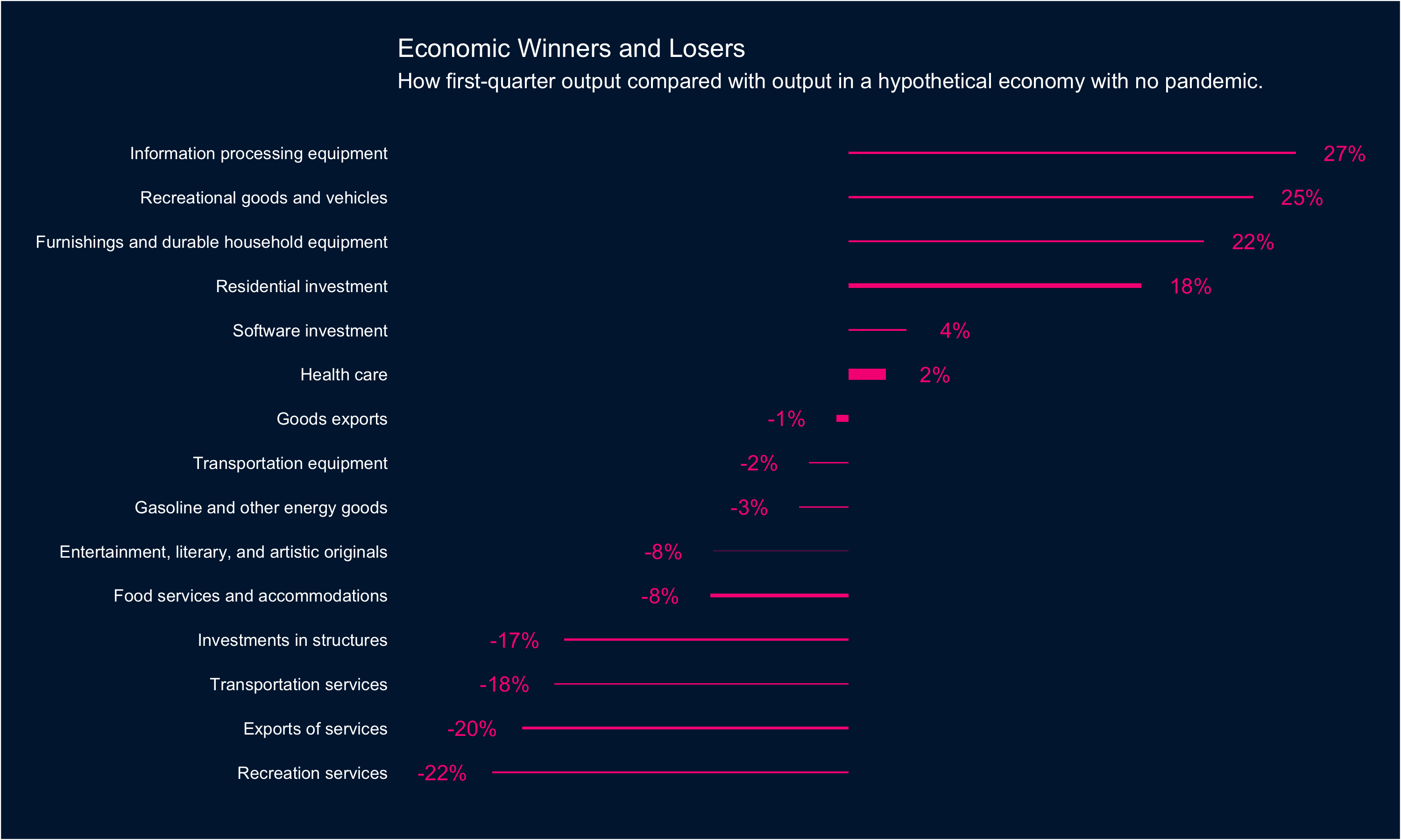
In this case there isn’t a ton of variance in the data: Health care is noticeably bigger than other sectors (and Entertainment noticeably smaller) but otherwise there aren’t huge swings from sector to sector.
If you’re interested in the code you can find it all here: rentry.co/beagdp