Via this week’s Data is Plural email, the CDC’s daily vaccination statistics are being hosted on GiHub here. These are pretty amazing data, so I thought I’d take a quick look using some of my favourite R packages: ggplot2 and highcharter.
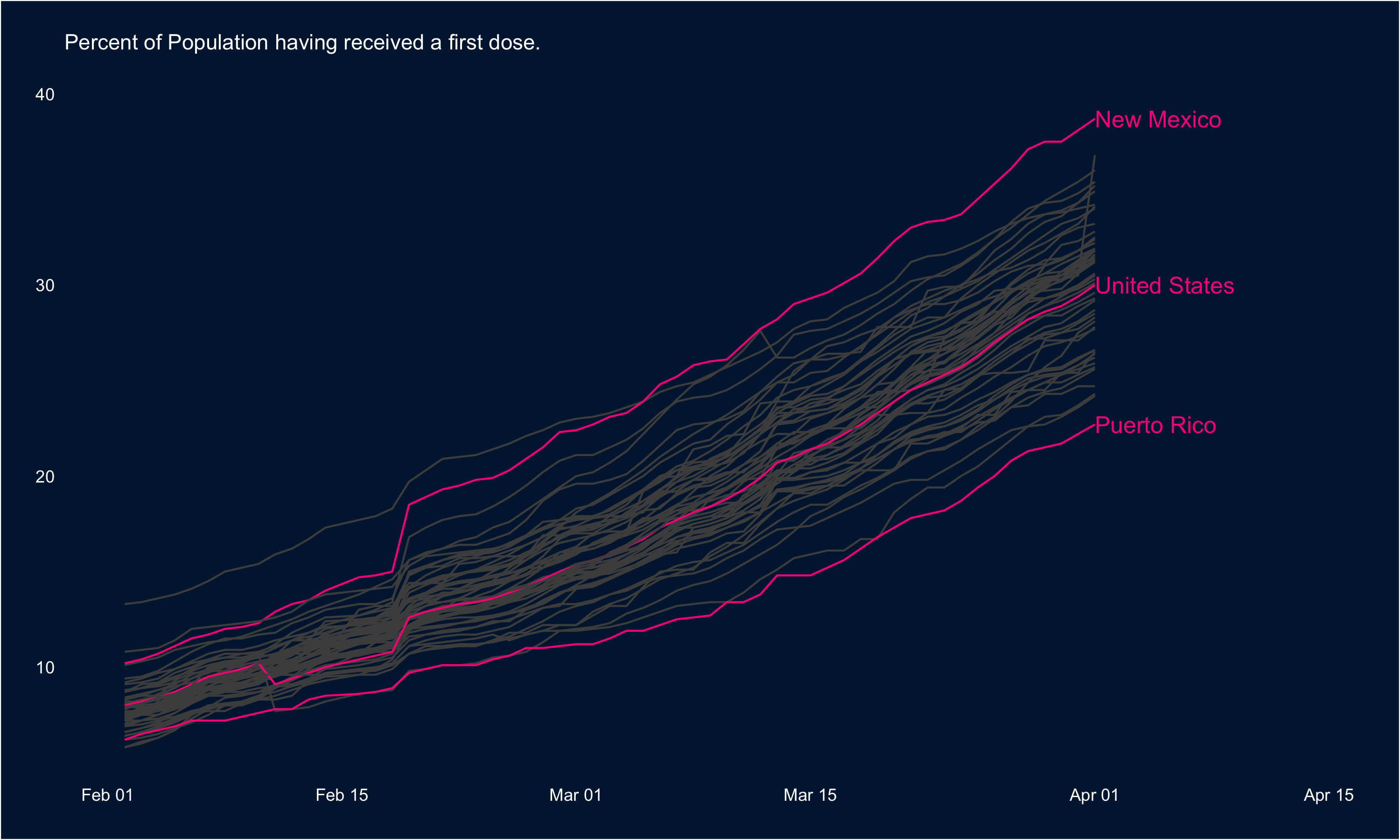
First, we can look at rate at which first doses are being administered across the States. In the visual below, I’ve highlighted the national trend as well as the tops and tails: New Mexico leads the way in terms of the percentage of the population having received a first dose, and Puerto Rico has the lowest rate.
These data are highly conducive to mapping as well, so I’ve put the most recent data (Apr 1) in a map below:
If you’re interested in the code you can find it all here: rentry.co/cdcvacc