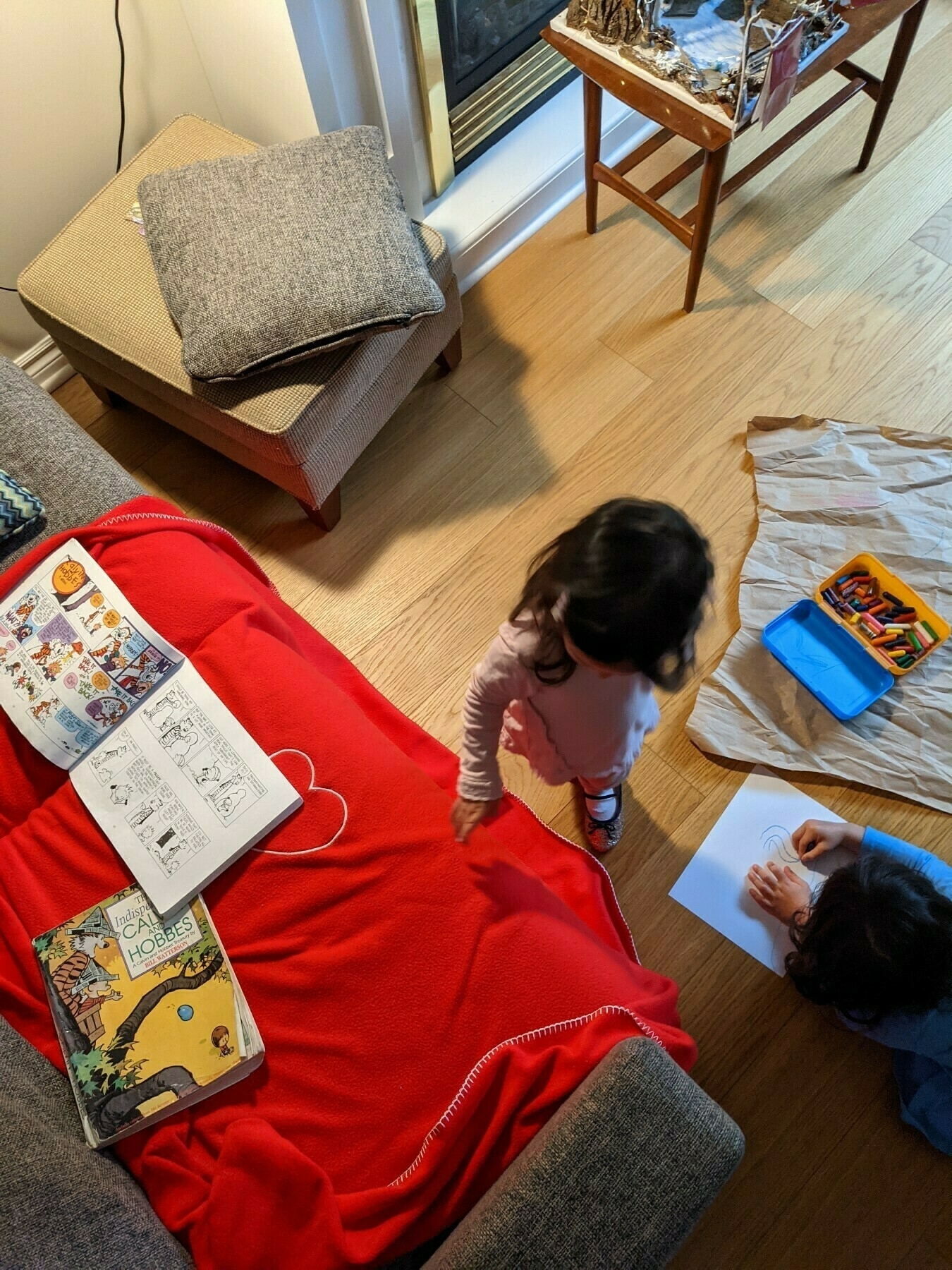
Reading the paper 📷

Reading the paper 📷
By letting people choose their own office adventures, employees can gain back some of what’s sorely missing in American work culture: self-determination. Need to plow through a task that will take you a full day? Stay home. Need to talk through some plans with a few co-workers? Everyone goes in. Kid got the sniffles? Expecting a delivery? Have dinner plans near the office? Do what you need to do to manage your life. Being constantly forced to ask permission to have needs outside your employer’s Q3 goals is humiliating and infantilizing. That was true before the pandemic, but it’s perhaps never been as clear as it is after a year in which many employers expected workers not to miss a beat during a global disaster unlike anything in the past century.
Saturday morning 🍕 📷

It is tricky to encode both absolute and percentage variables in the same visual.
Consider the main chart in this recent Upshot piece concerning Q1 2021 GDP figures. The story is about which sectors are doing better than expected and which are doing worse. They get at this in a fairy nifty way, by comparing actual results for Q1 to hypothetical Q1 results had all sectors grown at a 2% annual rate since Q4 2019. Given this, the main chart focuses on the percentage difference between the real Q1 and the hypothetical Q1. This is a wholly defensible choice.
What the chart doesn’t tell you is any information about the absolute size of each sector. In some cases that information is highly relevant. So in this visual, I thought about ways that you could potentially encode both without changing the basics all that much.
The Upshot story uses the Advance Estimate GDP data released by the Bureau of Economic Analysis. The BEA has an API and an R package that goes along with it but based on a cursory look I don’t think they’ve made the most recent data for Q1 2021 available through the API yet, so I downloaded the excel file (direct download link). I fudged the analysis a little bit: the key comparison in the Upshot relies on growth from Q4 2019, which isn’t in the file above, so I just used Q1 2020 (which is). As a result the numbers in the visual below aren’t 1:1 with the Upshot chart, but they are directionally consistent.
What I landed on was a visual I don’t think I’ve ever built before: a bar chart where the length of the bar encodes the percentage change (like the original) and the width of the bar encodes the absolute size of the sector (specifically, Q1 2021 billions of dollars, seasonally adjusted at annual rates).
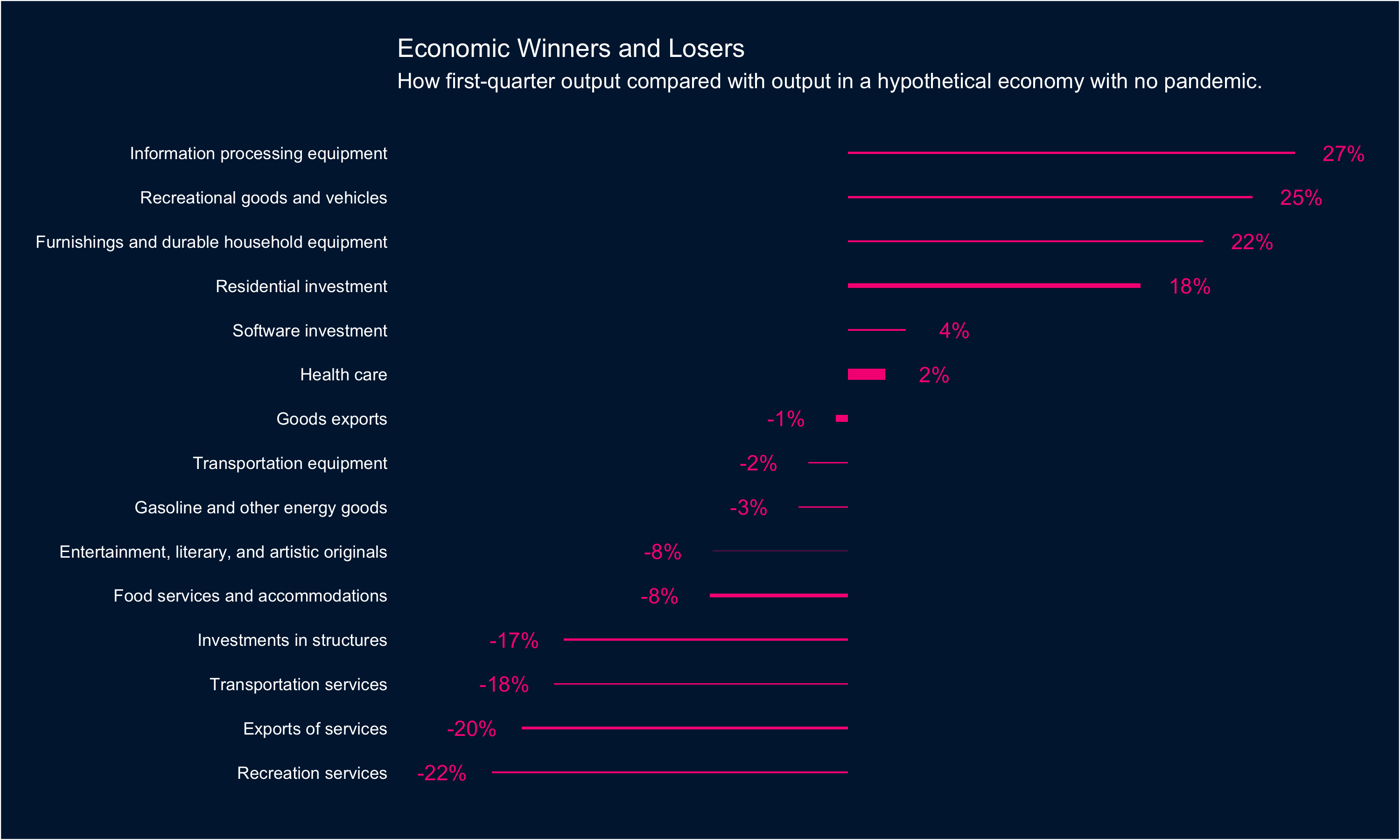
In this case there isn’t a ton of variance in the data: Health care is noticeably bigger than other sectors (and Entertainment noticeably smaller) but otherwise there aren’t huge swings from sector to sector.
If you’re interested in the code you can find it all here: rentry.co/beagdp
Going for a walk 📷

I don’t think I have ever learned a lesson in my life. I don’t watch somebody make a mistake and conclude, well, I’ll make sure I don’t do that, then. We pretend that we can learn lessons like this because the alternative is to face the music: to accept that most of what we do in our human lives is driven by some deep, old compulsion we can neither understand nor control, and that when it comes upon us, all we can do is hold on to the wrecked boat and pray. Or laugh, depending on our personalities.
From Savage Gods by Paul Kingsnorth. 📚
How my wife thinks our baby sees us 📷
Circular breakfast 📷
April 21, 2021: 🌨️📷

New neighbours 📷

Great minds think alike @alligator :) 📷
Saturday morning 📷
New York Times 📷
Spring magnolia 📷

It takes little talent to see clearly what lies under one’s nose, a good deal of it to know in which direction to point that organ.
From The Dyer’s Hand by W.H. Auden 📚
Discipline is the impossible conquered by the obstinate repetition of the possible.
From A philosophy of walking by Frédéric Gros. 📚
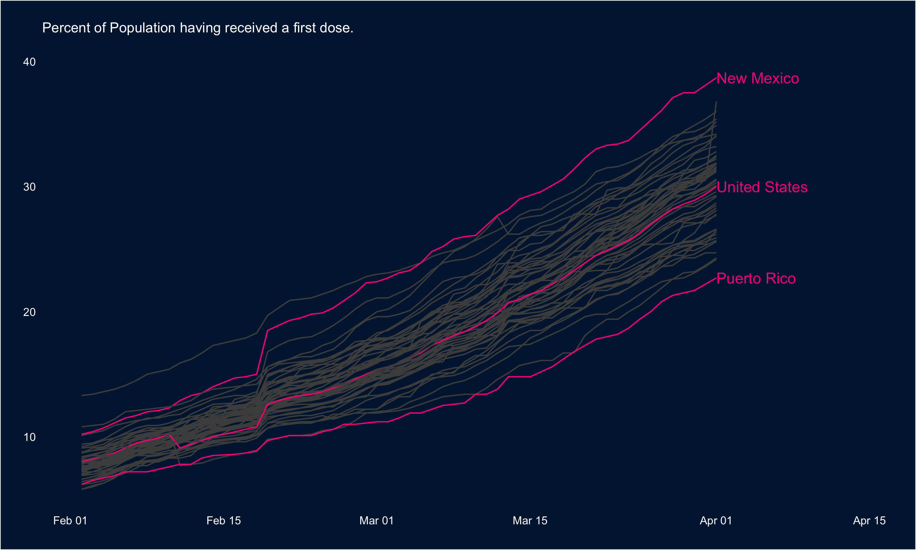
Via this week’s Data is Plural email, the CDC’s daily vaccination statistics are being hosted on GiHub here. These are pretty amazing data, so I thought I’d take a quick look using some of my favourite R packages: ggplot2 and highcharter.
First, we can look at rate at which first doses are being administered across the States. In the visual below, I’ve highlighted the national trend as well as the tops and tails: New Mexico leads the way in terms of the percentage of the population having received a first dose, and Puerto Rico has the lowest rate.
These data are highly conducive to mapping as well, so I’ve put the most recent data (Apr 1) in a map below:
If you’re interested in the code you can find it all here: rentry.co/cdcvacc
Early spring 📷

Human dignity must be associated with the idea of a scamp and not with that of an obedient, disciplined, and regimented soldier…. In the present age of threats to democracy and individual liberty, probably only the scamp and the the spirit of the scamp alone will save us from becoming lost as serially numbered units in the masses of disciplined, obedient, regimented and uniformed [removed pejorative]. The scamp will be the last and most formidable enemy of dictatorships. He will be the champion of human dignity and individual freedom, and will be the last to be conquered. All modern civilization depends entirely upon him.
From The Importance of Living by Lin Yutang 📚
Human personality is the last thing to be reduced to mechanical laws; somehow the human mind is forever elusive, uncatchable and unpredictable, and manages to wriggle out of mechanistic laws or a materialistic dialectic that crazy psychologists and unmarried economists are trying to impose upon him. Man, therefore, is a curious, dreamy, humorous and wayward creature.
From The Importance of Living by Lin Yutang 📚
[Ishiguro] is a planner, patient and meticulous. Before he begins the writing proper, he will spend years in a sort of open-ended conversation with himself, jotting down ideas about tone, setting, point of view, motivation, the ins and outs of the world he is trying to build.
Only once he has drawn up detailed blueprints for the entire novel does he set about the business of composing actual sentences and paragraphs. In this, too, he follows a set of carefully honed procedures.
First, writing very quickly and without pausing to make revisions, he’ll draft a chapter in longhand. He then reads it through, dividing the text into numbered sections. On a new sheet of paper he now produces a sort of map of what he has just written, summarizing in short bullet points each of the numbered sections from the draft.
The idea is to understand what the different sections are doing, how they relate to one another and whether they require adjustment or elaboration. Working from this sheet, he then produces a flow chart, which in turn serves as the basis for a second, more painstaking and deliberate draft. When this is finished to his satisfaction he finally types it up. Then he moves on to the next chapter and the process starts again.
From Kazuo Ishiguro Sees What the Future Is Doing to Us, The New York Times Magazine. 📚
📷

Net + sand + water = 👍 📷

Google’s Data Analytics Certificate is now live on Coursera. I’ve had the incredible privilege of contributing to its development over the last twelve months in a small way, and it’s great to see it out in the wild (already 693 reviews and a 4.7 out of 5 rating!) Check it out!