I reopened my digital map store today.
And then it is another day and another and another but I will not go on about this because no doubt you too have experienced time.
From Weather by Jenny Offill. I enjoyed it, and it has some lovely writing, but on the whole it felt more dated than any other fiction I’ve read recently. 📚
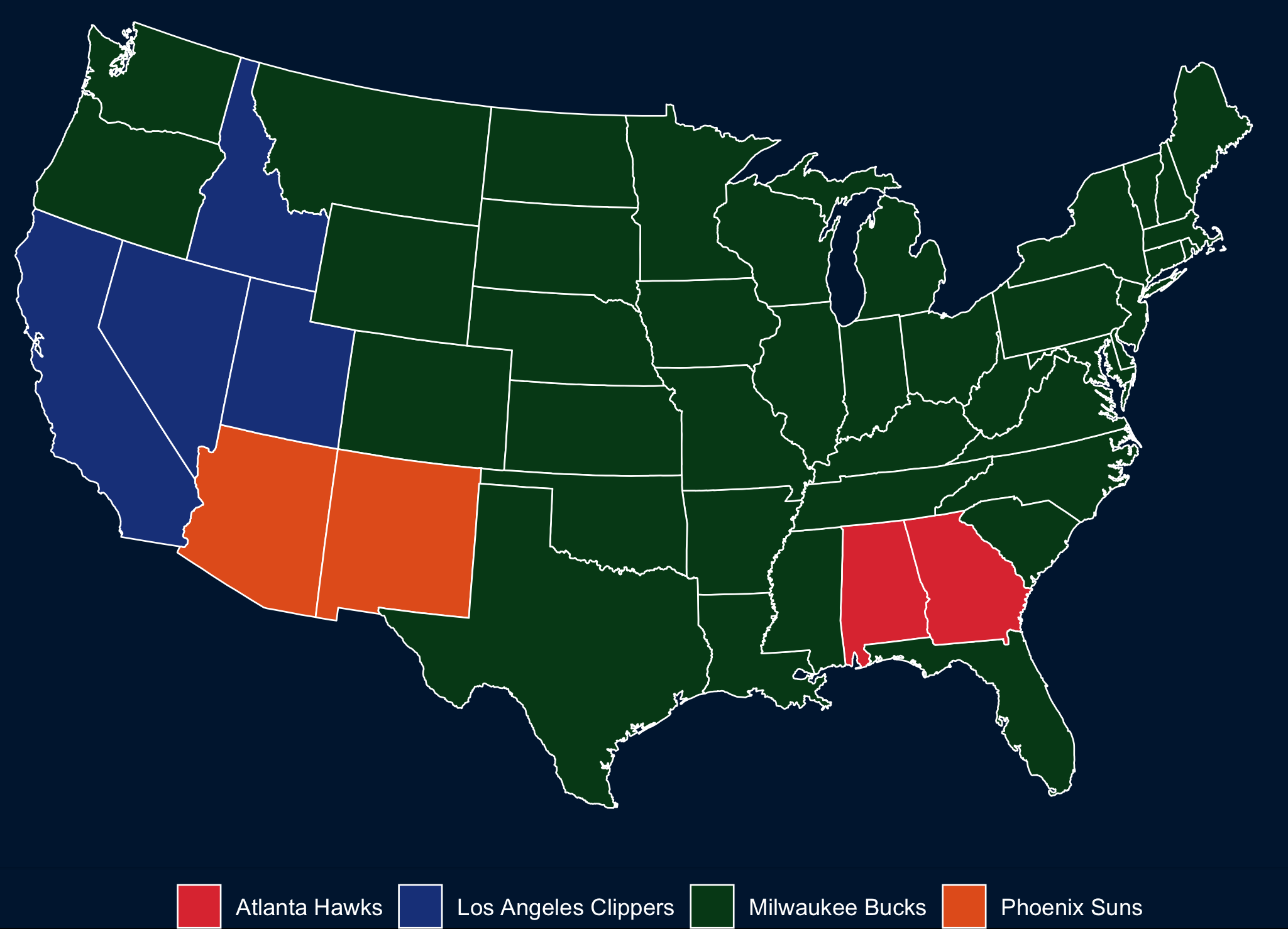
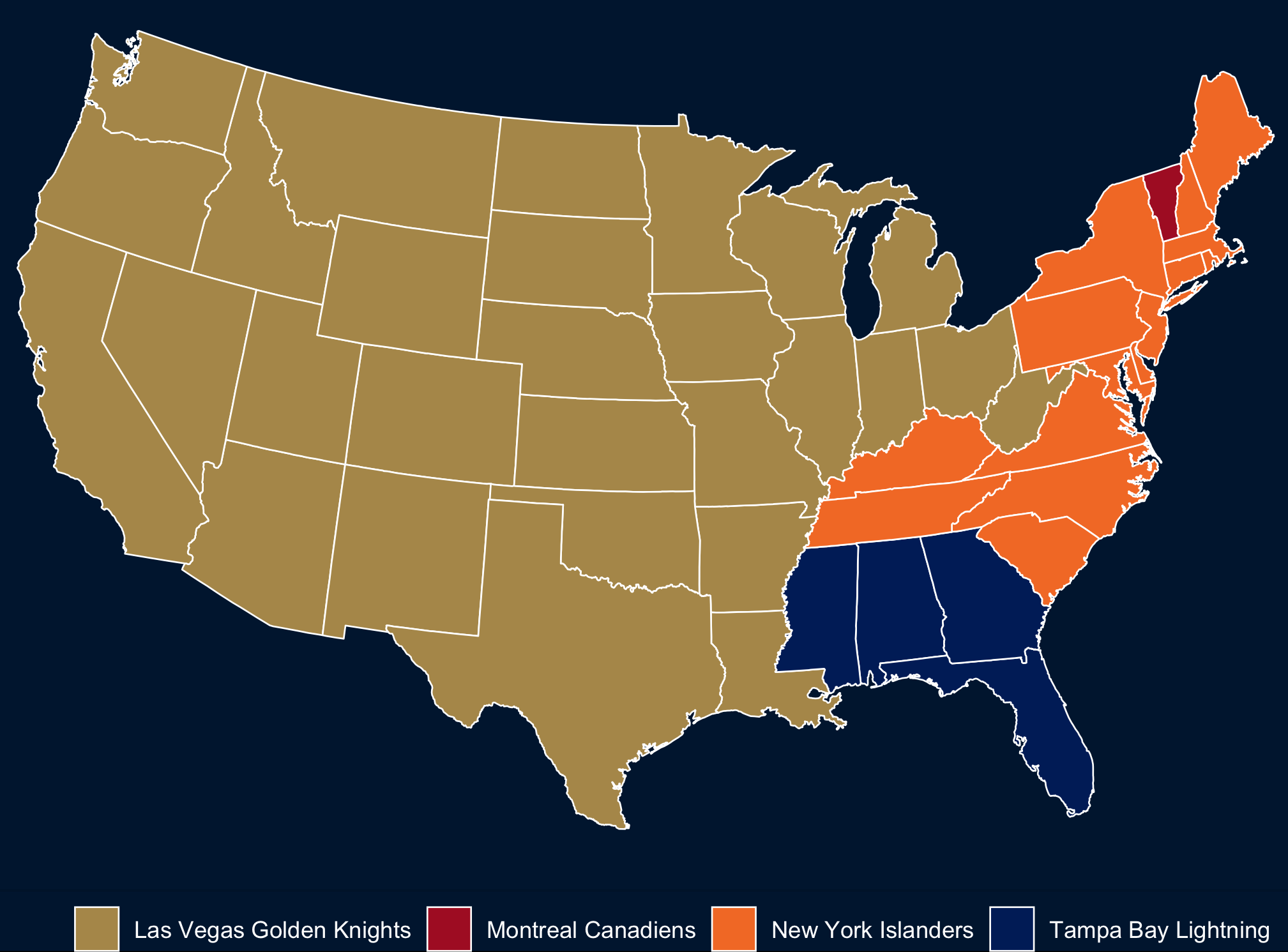
NBA Conference Finals: most searched team by state
Dad’s day Caesar 📷

🎈 📷

I found this story indicating that the New York Islanders are the most popular team across the US a little hard to believe, so I took a look at Google Trends. That seems a little more plausible. Then I made my own map, because I like maps. Code here: rentry.co/nhlmap.
Wading out 📷

Morning reading 📷

Geese in the fog 📷

I’ve never worked at FAANG so I don’t know what I’m missing. But I’ve hired (and not hired) engineers from FAANGs and they don’t know what they’re doing either.
For beginners, the most lucrative programming language to learn is SQL. Fuck all other languages. If you know SQL and nothing else, you can make bank. Payroll specialtist? Maybe 50k. Payroll specialist who knows SQL? 90k. Average joe with organizational skills at big corp? $40k. Average joe with organization skills AND sql? Call yourself a PM and earn $150k.
My job is easier because I have semi-technical analysts on my team. Semi-technical because they know programming but not software engineering. This is a blessing because if something doesn’t make sense to them, it means that it was probably badly designed. I love the analysts on the team; they’ve helped me grow so much more than the most brilliant engineers.
A lot of progressive companies, especially startups, talk about bringing your “authentic self”. Well what if your authentic self is all about watching porn? Yeah, it’s healthy to keep a barrier between your work and personal life.
A few of many amazing/hilarious bullets from Drunk Post: Things I’ve learned as a Sr Engineer, via Hacker Newsletter #557
Kite running 📷

Venkatesh Rao has a new subscribers only post out through his Substack, and it’s one of the most interesting things I’ve read in a while. The core idea is the importance of the studio organizational form to the post-COVID reboot, and in particular the “maker studio” where platform technology and other innovation enables a single person to get busy building and creating.
The Instapot is just a slightly fancy pressure cooker with some electronics and automation for safety. Pressure cookers are over a century old, but fell out of favor in the West because they were perceived as dangerous. They continued to be used in the developing world where consumers are both more comfortable with risk, and the upside for quicker cooking of common foods (beans and lentils) is high enough to make it worthwhile. But the small increase in safety and convenience through the integration of electronic smart controls has suddenly made pressure cooking attractive again at developed world levels of consumer risk tolerance. A clear indicator — my American-bred wife has always been too scared to use my low-tech Indian pressure cooker, and used to outsource things like cooking beans to me. But once we bought the Instapot, she was willing to do pressure cooking on her own.
The situation is the same in text media. If you do your accounting right (and this is a big, ongoing debate), a subscriber-based indie publishing activity built around Substack is about a tenth of the cost in time/money/skills acquisition/relationship management as one built around WordPress.
You can go from publication idea to functioning publication in about 20 minutes with no human contact. It’s an Instapot type effect. A small and relatively trivial expansion of the feature set creates a large increase in consumer-grade production capability, primarily via elimination of dependence on 1:1 human relationships.
Rao is the mind behind internet classics like Premium Mediocre, Domestic Cozy, and The Gervais Principle. I strongly recommend the newsletter!
Coffee lessons ☕📷

Friday night sky 📷

Occasionally I look at my wife’s beautiful iPhone 12 and think I’ll switch back. Here’s what keeps me loyal to my Pixel 5: the fact that I only charge it every other day, and the always on display.
Close encounter 📷

Togetherness first, battle second. In love, war should be peace by other means.
S. G. Belknap in Issue 23 of The Point.
Long weekend sky 📷

From an anonymous book review of Natasha Dow Schüll’s Addiction by Design: Machine Gambling in Las Vegas, hosted on Astral Codex Ten:
Before I read this book, I had an unsubstantiated theory for why people gambled: it’s because every gambler thought he would be the one to beat the odds. In other words, people gambled to earn money. Sure, gamblers knew that most other gamblers lose money, but that just means that gambling is a high-risk high-reward activity. Gamblers were willing to bear the risk in order to have a shot at the reward.
When it comes to machine gamblers, my theory is completely incorrect. People who spend hours and hundreds on machine games are not after big wins, but escape. They go to machines to escape from unpredictable life into the “zone.”
The primary objective that machine gambling addicts have is not to win, but to stay in the zone. The zone is a state that suspends real life, and reduces the world to the screen and the buttons of the machine. Entering the zone is easiest when gamblers can get into a rhythm. Anything that disrupts the rhythm becomes an annoyance. This is true even when the disruption is winning the game.
Lake views 📷

I was fooling around recently with some NHL stats visuals, and decided to update them tonight while watching the Caps-Bruins game (wouldn’t it be great if both teams lost?). Connor McDavid and Auston Matthews have had amazing seasons, and I was interested in putting their career success to date in the context of some of their peers. This was pretty easy, thanks to the folks at Quant Hockey.
The peerset for all of these visuals is Top 10 Active Goal scorers, plus McDavid and Matthews. To start, let’s take a look at cumulative career goals progressing along the x axis from the first season played to the most recent one (players with longer careers will have longer trend lines):
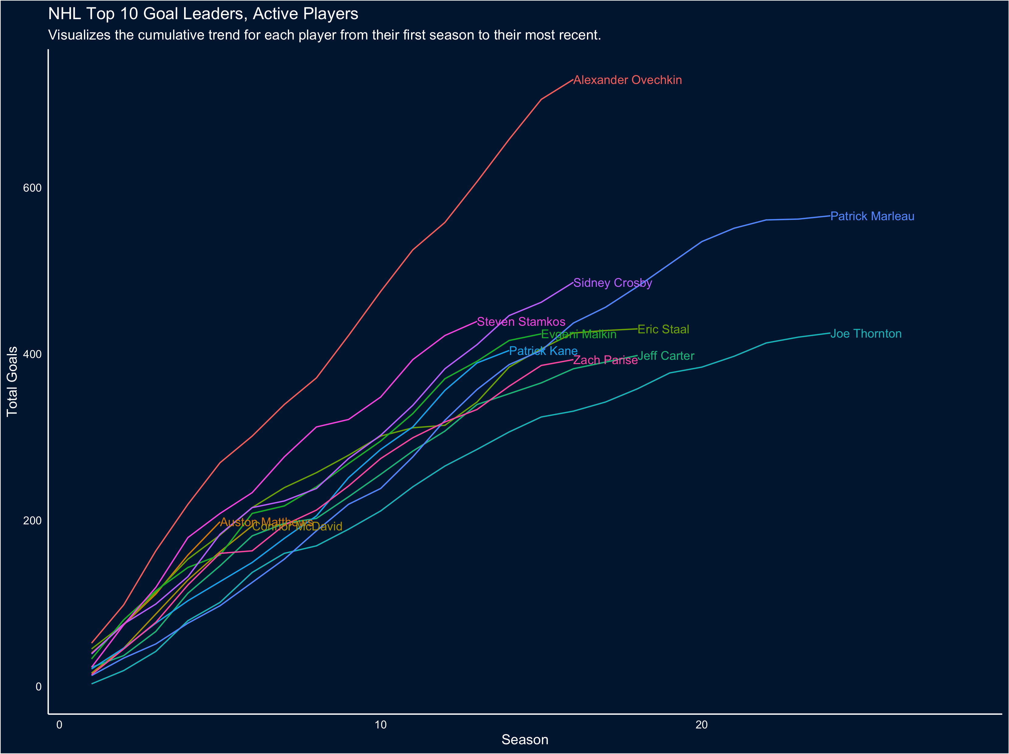
The first obvious takeaway from this chart is just how much of a goal-scoring beast Ovechkin is; also interesting to note the exceptional careers of Marleau and Thornton. But because of the number of trend lines it’s a little hard to pull out how McDavid and Matthews' careers-to-date scoring compares, so let’s restrict the visual to the first 6 seasons for each player (to match McDavid’s career so far):
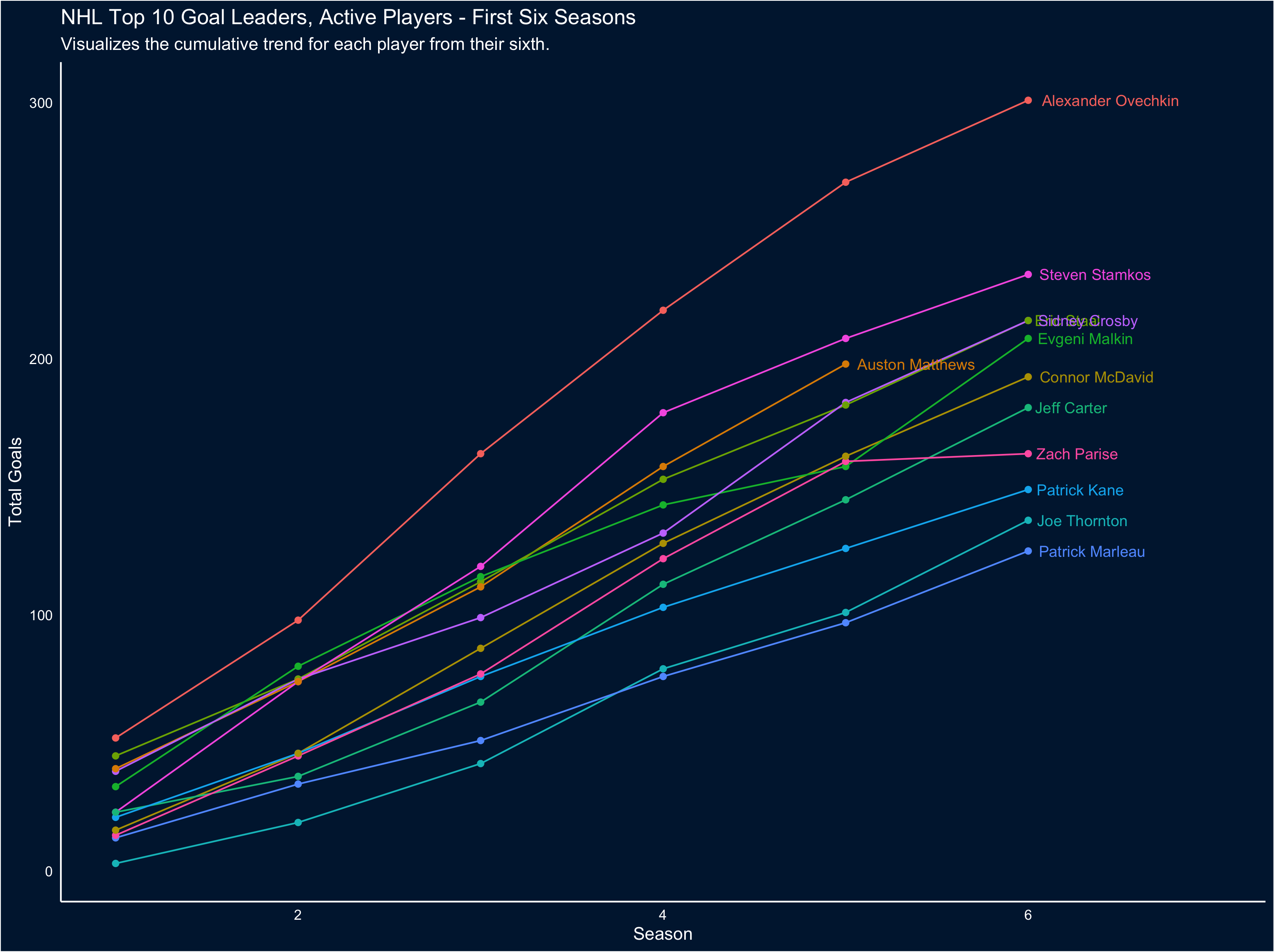
It’s easier to tell, here, exactly how special Matthews' goal scoring is: he’s outpacing everyone other than Stamkos and Ove (Incidentally, this also clearly demonstrates what a phenom Stamkos was and is).
Goal scoring is only part of the story - we can also look at total points. So let’s reproduce the first two visuals, but looking at cumulative points instead:
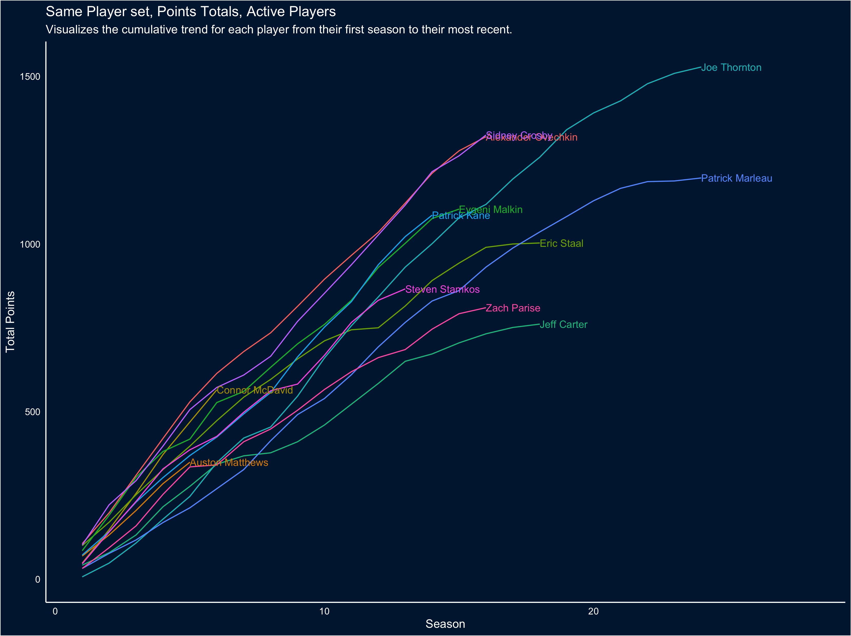
To me the amazing thing this visual captures is now neck-in-neck the careers of Crosby and Ovechkin have been… and also how much of an offensive powerhouse McDavid is, when assists are factored in. That only gets clearer when we focus on the first 6 seasons of each career:
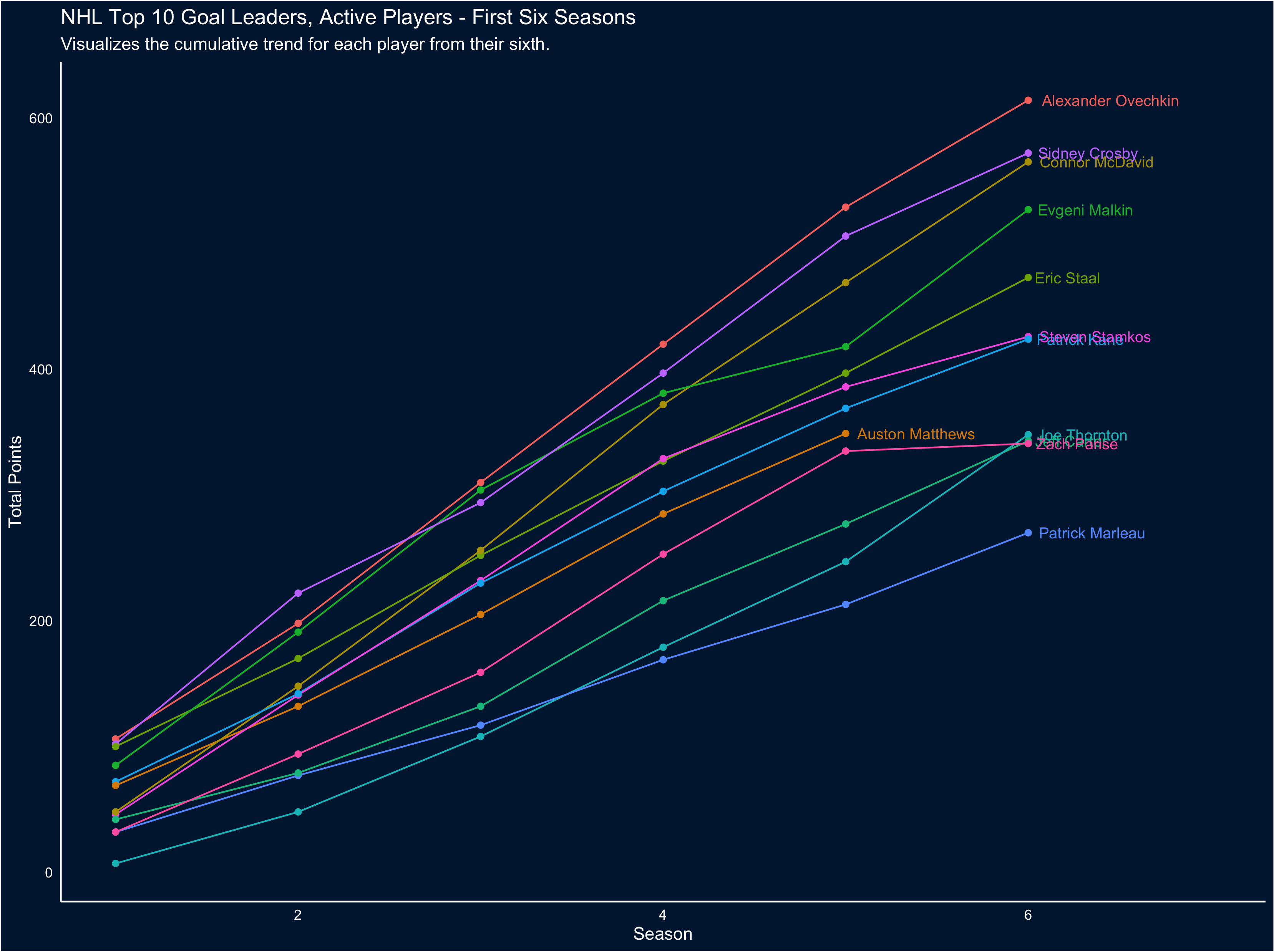
If you’re interested, you can find the code for these visuals at this link: rentry.co/scoring
Crosswords after lunch 📷

Fiddled with blog themeing this evening, and emoji navigation makes me happier than I expected :)